Votre panier est actuellement vide !

Dressage Equine Presets
5.00€
Dressage is a sport all about perfection, fluidity, and being one with the horse. That leads to the question: How do I Edit Perfect Dressage Photos? That is where this nifty post comes in. To have a beautifully edited photo, you need to have a good base to start on. Within this post, you will learn about shapes to look for and the basic editing to make your equine photos professional.
The best photographs highlight how well a horse moves: how much lift it gets off the floor and how much it flexes its joints at various points in the stride. In lower-level competitions, do not expect the grand movements and gestures as seen by Dressage sensations Carl Hester or Lottie Fry. Instead, look for lines.
Take a look at the image below to understand what to look for:

If you know nothing about horse riding or are new to the sport, look for lines and symmetry. All other composition rules apply to sport too, but bear in mind these certain aspects:
Red – The legs are reaching, balance and show a wide range of motion. Having the legs straight is more visually appealing for a profile shot as it shows balance.
Yellow – The horse is balanced and holding itself in a frame. The horse is a rectangle and is not leaning on its front or back.
Green – The horse is near behind the vertical. You are ideally looking for a perpendicular line.
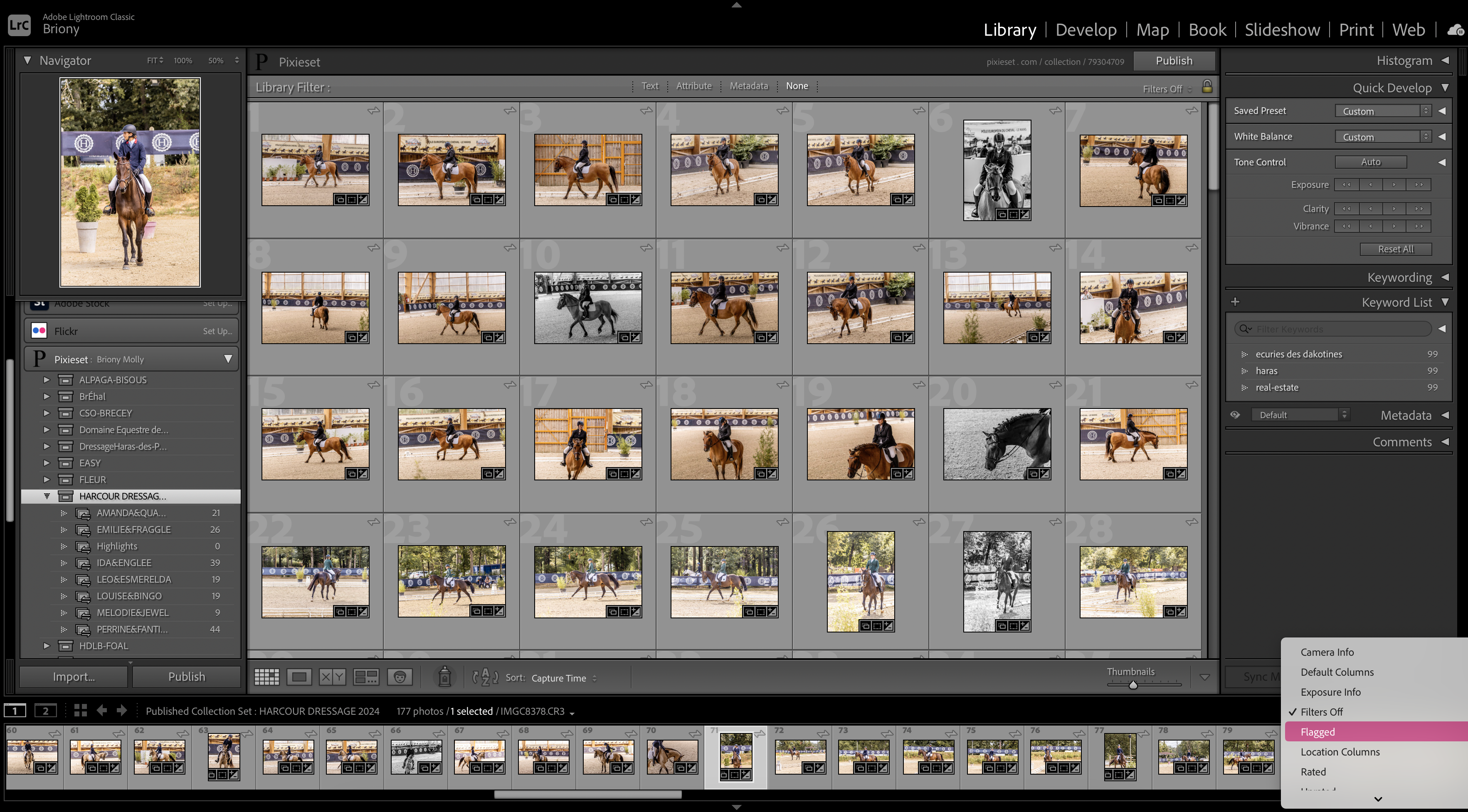
Editing flow varies from person to person. Personally, I use Adobe Creative Cloud, most notably Lightroom Classic. When it comes to sports photography, I personally like to make my picks first and then edit. In lightroom, I use the colour label and flag features to make my first picks and the export picks.

Once I have made the picks I then like to think mainly about the following:
White Balance
Horse coat colour
Background
Setting the white balance first makes it easier to work with the image. You can do this with the auto, or by selecting a neutral colour with the picker tool. After this, make sure the lens corrections are on and off we go!
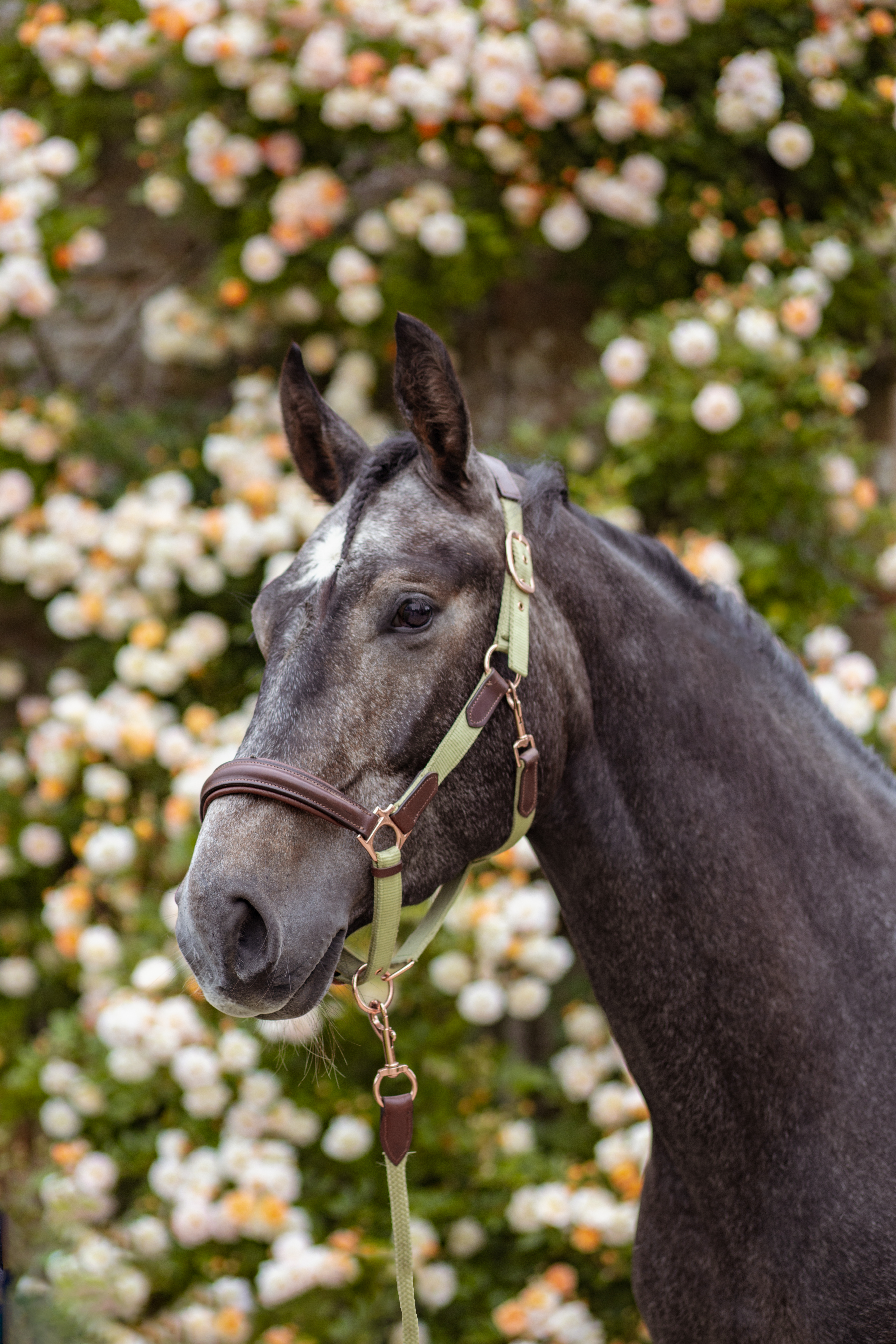
The Horse coat colour will be the main focus of editing. For a grey, it is easier to bring out the contrasts, the muscles and the details. A black horse or darker bay horse, it is more complicated to bring out details. For the darker horses, I like to use the shadow slider and brush tool to really bring out the details. As seen in the example below:

The background of an image is equally as important. Make sure there is nothing that takes away from the subject. If you can be aware of this while taking photos, even better. However, sometimes garish backgrounds can not be avoided. The easiest thing to do to help this is to create a de-sharpening mask. You can do this by using the “subject select” tool and then select invert. Use the texture, clarity, and sharpness sliders to create the desired effect.
You can try this yourself, or try out some premade presets to help you on mastering editing.
My last set of Equestrian presets are seeming to be super popular, so I have created a new pack full of different presets to enhance Dressage images. Presets are suitable for all Equine sports, but be aware they are specifically with the discipline of dressage in mind.
To add presets to your lightroom library, simply exact the zip folder and Import the presets via File>Import Develop Profiles and Presets…
For extracting the zip folder on an iPad, you will need to download an app for this capability or extract it on a computer to move back over to your tablet.
Et voila! You have your presets ready to go!
The presets are made with the different colour coats in mind, from greys, chestnuts, bays, blacks and more!
For examples of this preset see my latest Equestrian themed posts:
With this set of presets, I have included adjustments of exposure on each one making it even easier to edit your photos with Adobe Lightroom.
Please note that all the images are edited from canon raw files and exported to jpeg. Results for jpeg images may vary.

In Equine Photography, Colour Matters. In photography we are guided by the three C’s; Contrast, Composition, and colour. For portrait photographers, balancing colour to compliment skin tones is one of the main aspects, so why should equine image editing be any different?
In my last post, we cover a whole range of topics to get the basic ideas of photography. In this post, we delve a little deeper into the specifics. To truly be a master of your niche, you need to have the knowledge, as well as the experience. As a human, I am always learning. As a photographer, I am always developing style and experimenting. All artists need to branch out in order to stay inspired!
In this post:

Horse colour genetics are fascinating. We still don’t know everything to do with colour genealogy, but what we do know is already incredible. Let’s go over the basics as that’s all that we really need when it comes to Equine photography.
There are three basic coat colours. Black, Bay and Red (Chestnut). All other coat colours are from dilution genes and pattern genes, which show up in conjunction with the three basic colours. Grey horses hold a dominant trait, meaning that their colour will show through bay or red coats with one dominant gene. Whereas Red, chestnut horses are recessive meaning you need two genes to show this coat colour.
With the basic coat colours, you can get a mix of a horse appearing black with red genes, meaning in summer the horse’s mane and coat will lighten to a russet brown. A chestnut may have a slight black dilution to give them a coffee chestnut or liver chestnut coat colour.
A common dilution gene is the cream gene. The cream dilution in conjunction with the red coat leads to golden colours such as Palomino. Cream and bay create the darker buckskin with blackened points and a dark mane and tail.
Knowing about the basic coat colours and how the dilution genes work can really aid your photo editing and how to make coat colours shine in the most natural way possible.
Find out a more in-depth explanation here!

Understanding the genetic makeup of horse coat colours can really boost your editing skills. Knowing what undertones the coats carry helps enhance the colours. Coincidently, you can flatten the colours too using traditional colour theory with complimentary colours.
Black horses can appear to be dark brown, and for owners that is a problem as they know their horse is not a bay! In removing the red tones, you can make sure your portrait shoot of a black horse stays black.


The same principle works for adding a slight tint to the subject. For Palomino coats, the genetic makeup requires a chestnut, or red base, so adding a slight red hue to the horse brings the colour out stronger. Of course, it is only a slight addition of colour. For the image below I added a 8% red overlay on the pony to deepen the palomino colour.


The same principle can be applied to grey horses too. Young grey horses are often chestnut or black in appearance or lose their colour in dapples. For black bases, a cooler tint on the coat can enhance the grey and white colour, whereas a warmer tint works well on warmer roan colouring.

If you are interested in this concept but have no idea where to even start in Lightroom, I have created some coat-specific bundles, exactly for this in my store.
The store is always updating so keep an eye out for more coat specific bundles!