Your basket is currently empty!
Tag: psychology
The Importance of Colour Harmony
Elegance, style and balance. When looking at a well-designed piece, whether it is a logo, a website or a painting, it is all about the colours. In designing, picking colours for a piece is not necessarily just about what the designer thinks looks good. Countless amounts of research have shown that people are affected by exposure to colours. Whether it’s behavioural or emotional. It takes around 90 seconds for an individual to make a subconscious judgement on an item or person. 60-80% of the judgement is made up of colours perceived. This is the Importance of Colour Harmony.
The Importance of Colour Harmony
To really understand colour harmony, you need to look at the basics of colour theory. I remember back in High School when I took Art GCSE we looked at certain colour properties especially the colour wheel and saturation. Anyone who has had art classes or studied design already know the principles behind colour properties and in particular, the colour wheel.
Formed in the 1660s by Issac Newton, the colour wheel is built of the primary, secondary and tertiary colours, in a pragmatic way.

This colour wheel shows shades of pastels, midtones and brights as well as the pragmatic order of colour. It is split into different colour schematics. From simple monotone, warm and cold, and complimentary.
Colour Temperature
It’s easier to separate the colours into temperature and saturation. This is to describe their psychological effects so here are some of the emotions portrayed:
Hot – Aggressive and attention-grabbing. Normally seen on news-based websites, check out BBC, CNN, Reuters etc. They all lean towards warmer colours, whether it is their logos or web design.
Warm – Softer reds, oranges and yellows are more welcoming to us. Warmer tones are associated with inviting and welcoming designs, usually accent colours in waiting areas.
Cool– Purples, softer blues and greens give a meditative effect. Usually brings us back to nature with the association of relaxing flowers such as lavender.
Cold – Blues are associated with ice, water and freshness. Think of a combination of blue, turquoise and green. Cool colours are fresh. These colours are often used in packaging for laundry detergent and air fresheners.
Hues and Vibrancy
Pastels – Used to reflect the white space they are in. Often offices or hospitals will be painted in pastel shades to make the space look larger and more refreshing.
Pale – These colours are tints with a lot of white giving a faded effect. We often associate these colours with youth and innocence. Think to products for young children such as baby clothing and products. These colours are often associated with femininity. Most female products being pastel shades.
Brights – Usually the Primary colours or bold brights of secondary colours, think the use of these combinations by artists such as Mondrian or Andy Warhol. These are attention-grabbers and great for stand out products and websites.

Photo by Magda Ehlers on Pexels.com Psychology of Colour
Now we have the basis of temperatures, it is also good to know the break-down of individual colours:
Red – relates to energetic, passionate, action, ambition, love, anger, aggressive and determination. In some Asian cultures the colour red is lucky. In India, it is the colour of purity.
Orange – relates to adventurous, social, communicative, optimistic, enthusiasm, falsity, superficial and pessimism. Orange is also a sacred colour in many cultures. With the meaning of eternal happiness.
Yellow – relates to cheerfulness, fun, good-humored, confidence, originality, creativity, challenging, academic , wisdom, judgmental, impatient, impulsive, spiteful, cowardly and deceitful. In the middle east, yellow represents happiness and good fortune.
Green – relates to growth and vitality, renewal and restoration, self-reliance, nature, balance, possessive and materialistic, indifferent, envious, selfish, greedy, inconsiderate and calm. In western cultures, it is perceived as lucky. Whereas in Indonesia it is a forbidden colour. In the middle east, green represents youth, fertility and wealth.
Blue – relates to loyalty, trust, reliability, responsibility, conservatism, caring, contemplation, peaceful, depressed, passive, superstitious, predictable, aloof and frigid. It also promotes healing and safeguarding from evil in a lot of cultures.
Purple – relates to individual, creative and inventive, psychic and intuitive, humanitarian, mystery, fantasy, royalty, cynicism, arrogance, fraudulence.
Purple is traditionally associated with royalty. And by association, wealth. In Brazil and Thailand, purple is associated with mourning and honouring the dead.Pink – relates to romantic love, compassion and understanding, nurturing, romance, warmth, hope, calming, sweetness, naiveté, femininity, physically weak, over-emotional, over-cautious.
Brown – represents the down-to-earth, wholesome, practical, approachable, friendly, stable, structured, supportive, comforting, reliable, protective, dull, boring, frugal, materialistic, lack of humor, lack of sophistication, predictable and cheap.
Neutrals
Black – relates to comfort, strong, contained, formal, sophisticated, seductive, mysterious, pessimistic, secretive and withholding, conservative, serious and powerful. It represents masculinity in some African cultures and represents rebirth and mourning in the middle east.
White – represents innocence, purity, cleanliness, equality, complete, simplicity, immaculate, self-sufficient, pristine, sterile, stark, fastidious, empty, isolated, cautious, plain, distant and unimaginative. In Western cultures, the colour white symbolizes purity, peace, and cleanliness.
In Asian cultures, such as China and Korea, white represents death, mourning. This can mean bad luck. It is traditionally worn at funerals.
Colour Schematics
Let’s move on to the basic colour schematics. These aren’t necessarily all the colour schematics there are, just the most frequently used ones with examples. Furthermore, you can use Adobe colour to create your own!
Monochromatic
One colour on the wheel with multiple shade gradients from dark to light.

Photo by OVAN on Pexels.com Primary
The primary colours: yellow, blue and red.

Photo by Jonathan Cooper on Pexels.com Secondary
The secondary colours: green, purple and orange.

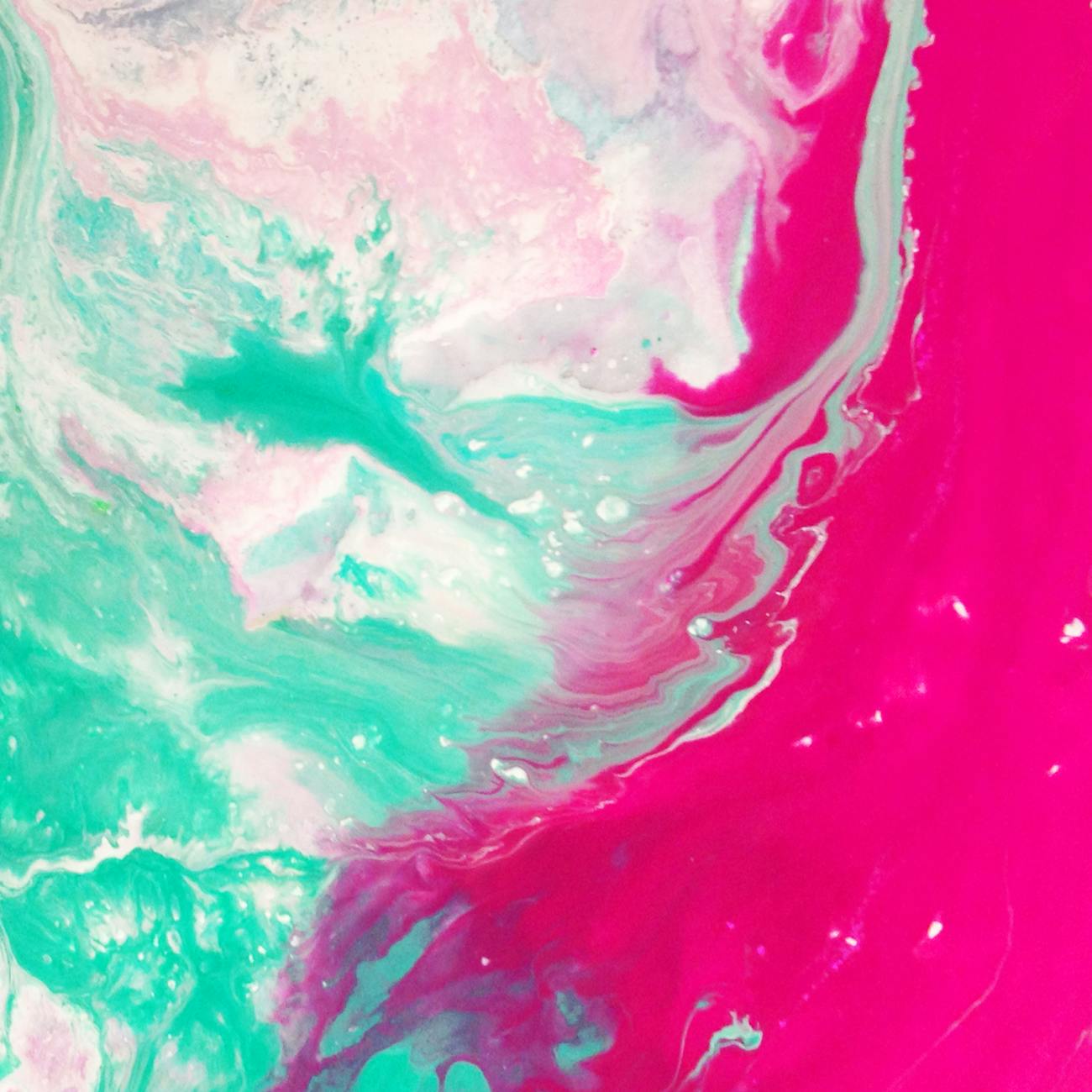
Photo by Al d’Vilas Complementary
Directly opposite each other on the colour wheel. Red and Green, Blue and Orange, Yellow and Purple.


Kelvin Valerio 
VictoriaStrelka_ph Achromatic
No saturation just shades.

Photo by Ron Lach on Pexels.com Analogous
Any three hues next to each other on the colour wheel.

Photo by Engin Akyurt on Pexels.com More Information
Now you have a general overview of colour harmony, it’s time to expand your design horizons.
Additionally, posts on design and photography, like The Importance of Colour Harmony, can be found here:
References for further additional reading:
Research on psychology and colour theory:
https://www.colorcom.com/research/why-color-mattersUseful colour scheme tool:
https://color.adobe.com/create/color-wheel/Briony-Molly