Your basket is currently empty!
Tag: work
Photography 101: Sports in the Rain
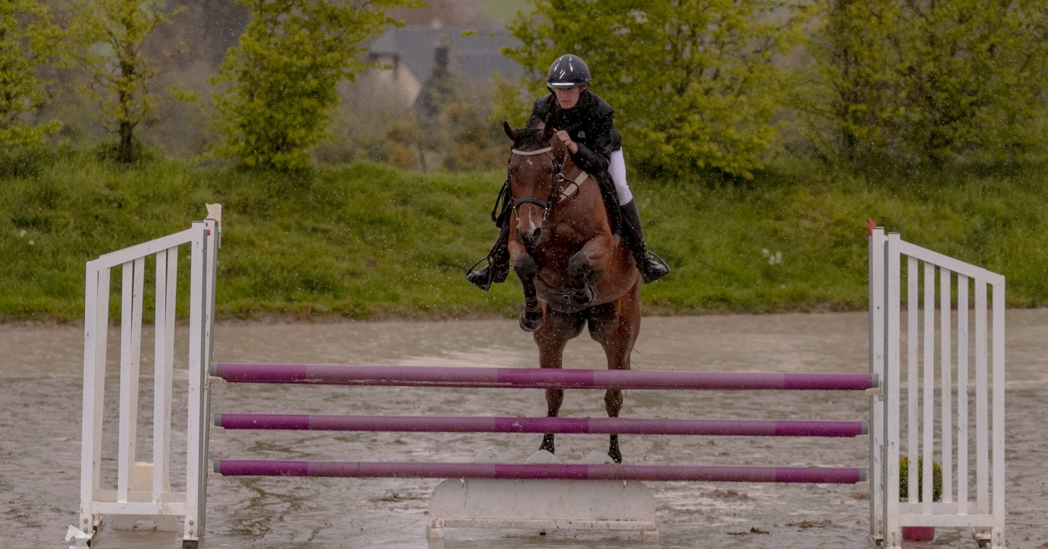
A challenge for all outside photographers: Sports in the rain.
The weather at the end of the year has always been temperamental in my experience of the northern hemisphere. What may start off as a cloudless blue sky can often morph into thick grey clouds unloading a deluge of rain, hail, or even snow. In my time as a sports photographer, I often see other photographers run and take cover during the rain and cover their equipment, while I am out there with my camera and lens facing the precipitation without so much of batting an eyelid. Of course, I know electricity and water do not mix, but surely a camera costing over a grand would withstand more than sunshine? That’s where the weatherproof, waterproof argument comes in.
Personally, I love the challenge of shooting in the rain. The amount of drama that can be captured through the motion of water, not just falling but from the splash effect of mud and puddles. Some of my favourite shots are from unexpectedly rainy days, including my last snapshot post here.
This post covers all the things I wish I knew before I started taking pictures in the rain, as well as some tips and tricks on equipment and settings!

Canon6Dii with 150-600mm Sigma lens 1/800 f/6,0 ISO 2000
What is Weatherproof?
Typically, a weatherproof camera has a number of seals around any points of dust and water incursion, which protect it against rain or splashes of water (rather than dropping it in a body of water). This means that a little fall of rain will rarely cause damage. However, continuous shooting in heavy rain can counteract weatherproofing.
The first thing is to know your gear. Some camera bodies are “weather resistant” and some are not. For example, the Canon 6D is not weatherproof, whereas the Canon 6Dii is. Lenses are also weather resistant so be aware that cheaper lenses may not be!
Be aware that using camera gear that is not weather-resistant can lead to water damage and other complications, such as fungus in the lens. To be sure this does not happen, regardless of your gear, make sure everything is dried out and cleaned thoroughly after the shoot.
Waterproof cameras are designed for total submersion, for people like scuba divers – so not a necessity for a sports photographer who sits out in the rain!
Extra Rain Equipment
Preparation for rainy shoots both expected and unexpected, I have found the best emergency rain gear for my set up is as follows:
Microfibre cloth – This is a game changer. You should have one of these anyway, but especially a life-saver in the rain. After getting rain in all the places, the screen, the viewfinder, and the lens, the best way to avoid smears from wiping the water away is with a quick rub with one of these beauts.
Plastic bag – These can be folded down really small, so great for packing in a corner spot. Plastic bags are waterproof, a cheap alternative to spending out on a designer Gortex camera poncho sleeve. I simply wrap the bag around the body and lens joint when in a pinch to ensure that the seal does not get broken. Be sure to remember that if you are working with horses some may find plastic bags the scariest thing out there so be mindful!
Duct Tape – Attach the bag to the camera in a more heavy-duty fashion. It is also just super handy to have on you encase equipment fails. Looking at you my non-trusty monopod!
A Wide-Brimmed hat – Handy on sunny days and rainy days. Personally, I find a baseball cap does the job for me providing extra cover between the sky and the viewfinder. I’ve encountered other photographers who use fishing hats or outback-style hats to the same degree.
Towel – This one is for you. Inevitably, you will be soaked to some degree. I wear a camera harness inside my main coat. This means when I shoot, the coat is open.
Gloves – Rain is cold. Cold hands are slow. This may be just my thing, but having gloves or some sort of hand protection during the rain can be a game-changer!

Canon6Dii with 70-200mm EOS lens 1/1000 f/4,0 ISO 1000
Sports in the Rain Tips and Tricks
One positive of shooting on consistent rainy days is not having to worry about what the sun is doing. Rainy, overcast days act like a giant soft box in terms of lighting so you don’t have to be rushing through settings to adjust to ever-changing cloud coverage and heady brightness. There are no harsh shadows either, meaning that everywhere your camera points are pretty much even. This works great for photographing people – a natural lightbox with soft shadows -works wonders to bring out the good side!
Want to capture the rain in all its glory? The trick is shutter speed. The higher the shutter speed, the better the rain will look frozen in mid-air for the photo.
Typically, I like to use a minimum shutter speed of 1/800 to capture the “splash” images. However, you do need to remember the exposure triangle, as I have mentioned in previous posts to make sure that the image comes out balanced.
A general overview of my rainy settings during the day are:
ISO limited 2000
f/4.0 – f/6.0
1/800-1/1250One of the biggest challenges to shooting in the rain is the focus. The auto-focus on your camera may jump around as it is picking up the rain between you and the subject. Especially if you are using the `AI-SERVO for capturing sports. Plan on having some out-of-focus images, especially if there is heavy rain – don’t be too critical either!
Keep your lens hood attached! This may seem logical to some, but having the lens hood on will add extra protection to the front element of your lens, meaning less fog and fewer unwanted droplets.
Another simple tip is to shoot out of the wind. What is worse than rain – rain blowing straight into your face and camera lens. If possible, find a spot that has some natural shelter from the wind and rain, or at least the wind!

Canon6Dii with 70-200mm EOS lens 1/1000 f/4,0 ISO 1000
After the Shoot
It may be very tempting to pack up, remove lenses and shove everything into your bag as soon as possible during a rainy shoot, but that is not the best idea. Keep the lens attached to the body, as the seal is still in place.
Probably the most important thing you can do when shooting in the rain is what you do after. If you have the luxury of being able to dry your camera and put it away properly, do it. If not it is best to leave the camera assembled until you have the chance to make sure it is dry.
When you have the chance to attend to your wet camera, if you have not done so already, take the camera apart and give it a full wipe-down. Use the aforementioned microfibre cloth to dry and clean the lens elements. Make sure to fully extend any telephoto lenses if it has a body that grows and shrinks as you zoom in and out to ensure dryness. If you are not sure it is 100% dry, place all your gear on a towel in a dry warm place. Do not place it near a heat source like a fire or a heat vent as these could cause other types of damage to your gear.

Canon6Dii with 150-600mm Sigma lens 1/800 f/6,0 ISO 2000
In my latest shoot, I had the misfortune of it being both rainy, windy, and bright. Meaning that I was constantly scrolling through my shutter and ISO to balance pictures. I did have the luxury of a warm cafe in between classes. Nothing beats warming up in front of a fire with ever-so-needed coffee! This did allow me to make sure all my equipment was still functioning properly. And not getting swamped throughout the day, unlike me. With the rain, setting up for where the best shots took me less time. This probably meant that I did not find the best places either. All being said, I did manage to get some dramatic puddle shots as well as some lovely jumping pictures.
The most important part of shooting in the rain is making sure you are waterproofed too. A good coat, and as I mentioned, a hat and gloves are essential, especially in the colder months. So wrap up warm, grab a coffee to go, and get out there!
Is there anything I missed? Let me know in the comments!
If you want to know more about the settings I use for my photography, have a look at my previous snapshot posts below:
I am currently taking bookings for shoots and competitions local to me. Feel free to get in touch for information!
What is Focal Length in Photography: Understand Your Lenses
Understanding camera terminology can be intimidating. When learning about photography for the first time as a fresh 16-year-old, the whole terminology behind the camera, and sitting in a lecture about how the camera works, did nothing for me. I wanted to be out there with my DSLR taking a photo and learning on the go. Not sitting learning the intricacies of what glass was first used for lenses and how it was made! So I have taken it upon myself to keep things a bit simpler when sharing the art of photography. Onto something that baffled me for a while, focal length – what is it?
What is it?
Focal length is the basic description of a lens. It is not a measurement of the actual length of a lens, instead, it represents a calculation (in mm) of an optical distance from the point where light rays converge to form a sharp image of an object to the sensor at the focal plane in the camera. The length calculation is determined when the lens is focused at “infinity.” That’s the scientific explanation of what focal length is. But what does that mean?
Lens length tells us how much of the scene will be captured (angle of view), and how large individual elements will be (magnification):
The human eye has an equivalent focal length of 45mm.
The longer the focal length, the narrower the angle of view and the higher the magnification.

The shorter the focal length, the wider the angle of view and the lower the magnification.

Using Focal Length
It’s all well knowing what it is, but how do you use it in a practical application?

Wide Angle Lenses
Usually any lens under 50mm. These are practical for landscape photography, as well as interiors.Prime 50mm Lenses
A prime lens refers to a non-zoom/telephoto lens. It has a fixed focal length. 50mm is the closest to our eyesight. It is what most photographers use for portraits.
This image has a length of 50mm at f/1.8.

Telephoto 70-200mm Lenses
Telephoto or zoom lenses refer to lenses that can move between two focal points. A popular one is 70-200mm or 70-300mm.Super Telephoto 150-600mm
A length over the 300mm mark is popular for nature photography or sports. Personally, I used the Sigma 150-600mm for bird photography, as well as sports photography.
Finding The Focal Length
The length of your lens is marked on the front of the glass, as well as on the side of telephoto lenses. The information is stored within the metadata of your photos and available to see in editing programs, and the raw file itself.
What is it? (in Numbers)
If you want to get into the details of angles, here is a conversion of focal length to the angle of view:
Focal Length Angle of View 12mm 122° 16mm 107° 24mm 84° 35mm 63° 50mm 47° 70mm 34° 90mm 27° 100mm 24° 200mm 12° 400mm 6° It is important to remember that the angle of view can cause distortion of an image. This is why using the lens correction function is so important in editing, especially with images of people!
Now if you have any questions – feel free to comment or contact me.
For more photography posts look here.
The Importance of Colour Harmony
Elegance, style and balance. When looking at a well-designed piece, whether it is a logo, a website or a painting, it is all about the colours. In designing, picking colours for a piece is not necessarily just about what the designer thinks looks good. Countless amounts of research have shown that people are affected by exposure to colours. Whether it’s behavioural or emotional. It takes around 90 seconds for an individual to make a subconscious judgement on an item or person. 60-80% of the judgement is made up of colours perceived. This is the Importance of Colour Harmony.
The Importance of Colour Harmony
To really understand colour harmony, you need to look at the basics of colour theory. I remember back in High School when I took Art GCSE we looked at certain colour properties especially the colour wheel and saturation. Anyone who has had art classes or studied design already know the principles behind colour properties and in particular, the colour wheel.
Formed in the 1660s by Issac Newton, the colour wheel is built of the primary, secondary and tertiary colours, in a pragmatic way.

This colour wheel shows shades of pastels, midtones and brights as well as the pragmatic order of colour. It is split into different colour schematics. From simple monotone, warm and cold, and complimentary.
Colour Temperature
It’s easier to separate the colours into temperature and saturation. This is to describe their psychological effects so here are some of the emotions portrayed:
Hot – Aggressive and attention-grabbing. Normally seen on news-based websites, check out BBC, CNN, Reuters etc. They all lean towards warmer colours, whether it is their logos or web design.
Warm – Softer reds, oranges and yellows are more welcoming to us. Warmer tones are associated with inviting and welcoming designs, usually accent colours in waiting areas.
Cool– Purples, softer blues and greens give a meditative effect. Usually brings us back to nature with the association of relaxing flowers such as lavender.
Cold – Blues are associated with ice, water and freshness. Think of a combination of blue, turquoise and green. Cool colours are fresh. These colours are often used in packaging for laundry detergent and air fresheners.
Hues and Vibrancy
Pastels – Used to reflect the white space they are in. Often offices or hospitals will be painted in pastel shades to make the space look larger and more refreshing.
Pale – These colours are tints with a lot of white giving a faded effect. We often associate these colours with youth and innocence. Think to products for young children such as baby clothing and products. These colours are often associated with femininity. Most female products being pastel shades.
Brights – Usually the Primary colours or bold brights of secondary colours, think the use of these combinations by artists such as Mondrian or Andy Warhol. These are attention-grabbers and great for stand out products and websites.

Photo by Magda Ehlers on Pexels.com Psychology of Colour
Now we have the basis of temperatures, it is also good to know the break-down of individual colours:
Red – relates to energetic, passionate, action, ambition, love, anger, aggressive and determination. In some Asian cultures the colour red is lucky. In India, it is the colour of purity.
Orange – relates to adventurous, social, communicative, optimistic, enthusiasm, falsity, superficial and pessimism. Orange is also a sacred colour in many cultures. With the meaning of eternal happiness.
Yellow – relates to cheerfulness, fun, good-humored, confidence, originality, creativity, challenging, academic , wisdom, judgmental, impatient, impulsive, spiteful, cowardly and deceitful. In the middle east, yellow represents happiness and good fortune.
Green – relates to growth and vitality, renewal and restoration, self-reliance, nature, balance, possessive and materialistic, indifferent, envious, selfish, greedy, inconsiderate and calm. In western cultures, it is perceived as lucky. Whereas in Indonesia it is a forbidden colour. In the middle east, green represents youth, fertility and wealth.
Blue – relates to loyalty, trust, reliability, responsibility, conservatism, caring, contemplation, peaceful, depressed, passive, superstitious, predictable, aloof and frigid. It also promotes healing and safeguarding from evil in a lot of cultures.
Purple – relates to individual, creative and inventive, psychic and intuitive, humanitarian, mystery, fantasy, royalty, cynicism, arrogance, fraudulence.
Purple is traditionally associated with royalty. And by association, wealth. In Brazil and Thailand, purple is associated with mourning and honouring the dead.Pink – relates to romantic love, compassion and understanding, nurturing, romance, warmth, hope, calming, sweetness, naiveté, femininity, physically weak, over-emotional, over-cautious.
Brown – represents the down-to-earth, wholesome, practical, approachable, friendly, stable, structured, supportive, comforting, reliable, protective, dull, boring, frugal, materialistic, lack of humor, lack of sophistication, predictable and cheap.
Neutrals
Black – relates to comfort, strong, contained, formal, sophisticated, seductive, mysterious, pessimistic, secretive and withholding, conservative, serious and powerful. It represents masculinity in some African cultures and represents rebirth and mourning in the middle east.
White – represents innocence, purity, cleanliness, equality, complete, simplicity, immaculate, self-sufficient, pristine, sterile, stark, fastidious, empty, isolated, cautious, plain, distant and unimaginative. In Western cultures, the colour white symbolizes purity, peace, and cleanliness.
In Asian cultures, such as China and Korea, white represents death, mourning. This can mean bad luck. It is traditionally worn at funerals.
Colour Schematics
Let’s move on to the basic colour schematics. These aren’t necessarily all the colour schematics there are, just the most frequently used ones with examples. Furthermore, you can use Adobe colour to create your own!
Monochromatic
One colour on the wheel with multiple shade gradients from dark to light.

Photo by OVAN on Pexels.com Primary
The primary colours: yellow, blue and red.

Photo by Jonathan Cooper on Pexels.com Secondary
The secondary colours: green, purple and orange.

Photo by Al d’Vilas Complementary
Directly opposite each other on the colour wheel. Red and Green, Blue and Orange, Yellow and Purple.


Kelvin Valerio 
VictoriaStrelka_ph Achromatic
No saturation just shades.

Photo by Ron Lach on Pexels.com Analogous
Any three hues next to each other on the colour wheel.

Photo by Engin Akyurt on Pexels.com More Information
Now you have a general overview of colour harmony, it’s time to expand your design horizons.
Additionally, posts on design and photography, like The Importance of Colour Harmony, can be found here:
References for further additional reading:
Research on psychology and colour theory:
https://www.colorcom.com/research/why-color-mattersUseful colour scheme tool:
https://color.adobe.com/create/color-wheel/Briony-Molly